What does it take to make a
good movie poster? Well for starters, some actual effort should
probably be exerted into the process. Yes a poster is a piece of
marketing material, but it’s also a still image representation that
should incorporate moods, feelings, and possibly themes of the film
that mirror the film which it is representing. It’s supposed to get
people psyched to see a movie, but that doesn’t necessarily mean that
it has to look like a bad Photoshop job. A movie poster can be a piece
of art that very heartily supplements the movie in ways that you may
not even have noticed before. After spending weeks (an hour or two)
going through all the horror movie posters I could find, I am pleased
to present you with what I feel are the ten best horror posters from
2008.
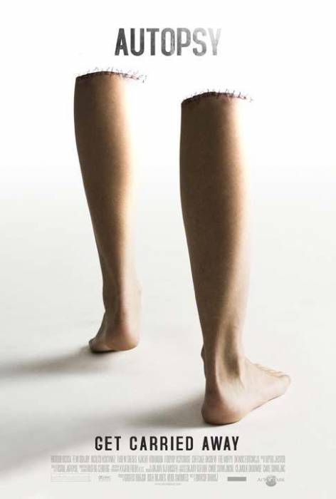
10: Autopsy Well it definitely
isn’t the best poster ever made, but it is still pretty inventive. You
have already seen posters very similar to this in the Saw marketing
campaign but they always drifted more towards the visceral side rather
than just the disturbing. I think what really gets to me about this
poster is the absolute simplistic and empty space with two severed legs
whose muscle tension makes it look like they are walking away. That
little bit put some character into something that is normally
overlooked.
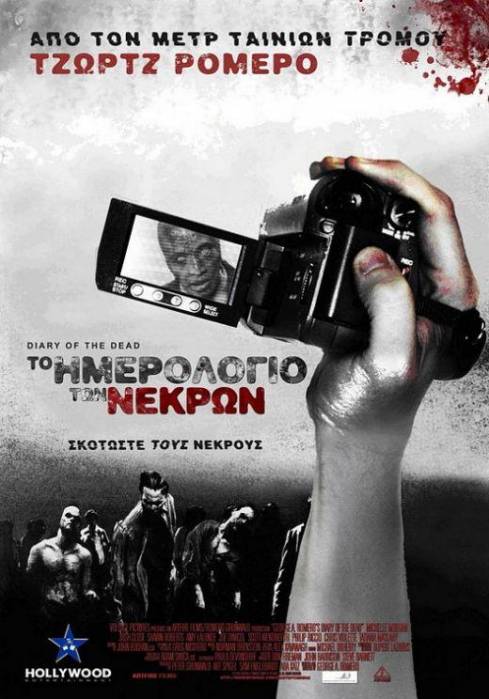
9: Diary Of the Dead: What I
really like about this poster is that fact that it is an actual
drawing. It’s not strictly Photoshop and it’s definitely not any kind
of real world captured image. I’m not certain which country this
poster is from, but it does a much better job at capturing what the
movie is all about than the North American Version (which makes it look
like an action thriller). The camera is capturing the action while a
zombie is clearly in the viewfinder. Kind of like the camera operator
is too concerned about what’s in the distance to see the inherent
danger right in front of him.
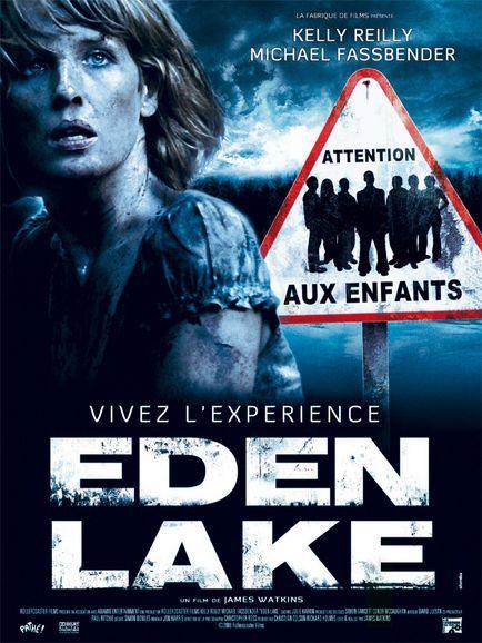
8: Eden Lake This is the French
version of the poster and although it is commonplace to put the main
character all beat up on the poster, the road sign really makes the
poster pop. It’s a completely different color than anything else on
the poster so it demands your attention to it, just like the kids in
the film demand attention from (and terrorize) the young couple. It’s
clever and it adds a little more to the whole experience that just a
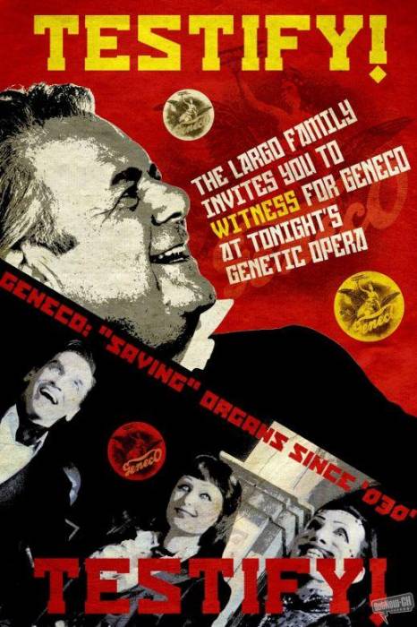
picture of her and the lake. 7: Repo: The Genetic Opera: What
makes this poster succeed is the fact that I don’t know if it’s an
actual promotional poster for the movie or if it’s a flyer that was
used for an event within the world of the movie. All of the posters in
REPO follow this aesthetic which is a pretty brave move. It is exactly
in tune with what the movie is all about when we could have easily
gotten a poster that tricked the viewer into thinking that this wasn’t
a musical (like the poster for Sweeny Todd). Not only that but the
layout is amazing using only monotone Black and White mixed with a
grand total of 4 other colors. It’s the least colored colorful poster
you have seen in a while.
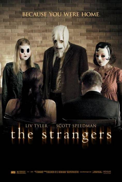
6: The Strangers: This is a
poster that I feel gives away a bit too much of the movie, including
one of the best lines in the whole thing and somehow, it’s still creepy
as hell. Although we can’t see it to well, we can tell that the people
in the foreground (who are the stars of the film, whose names you see
under them) are bound to their chairs with three creepy masks staring
them down. Add that to the boring and plain brick background while
the stars of the movie have their backs and all of a sudden, the
audience gets a nice visual queue to who the real main characters are.
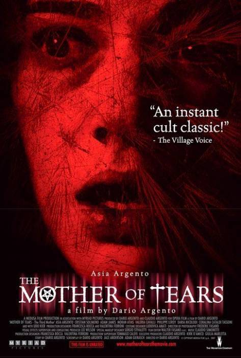
5: Mother of Tears The cult
classic movie is a tricky one to place and an impossible genre to
“call” in advance. It takes years of brewing while the millions of
underground fans find one another to henceforth turn it into a cult
classic. I wouldn’t exactly trust the Village Voice’s opinion here
(or anyone who tells me a movie in an instant cult classic) which is
why the poster is in the middle of the list. Nevertheless, the picture
of Asia Argento in a semi casually startled look is a subtle little
hint to the viewer of the terror they will face. It’s fairly simple,
classical, and does a lot with the colors of red and black. It’s just
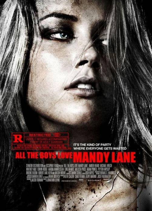
pretty. 4: All the Boys Love Mandy Lane This
one could have easily been number one if it weren’t for the tagline
that makes it sound like a bad 80’s slasher. In the poster, we are
assumed that this is a beat up Mandy Lane (told you this happens a lot
nowadays) with a grainy look that the film also shares. The poster
itself asks so many questions. Are all the boys trying to get her? Is
she running from something or someone? Is she on the attack? She
doesn’t seem too scared, is she just a dirty girl? It’s also pretty
cool that the MPAA’s R stamp is overly-large and actually above the
title. It’s a nice way to tell the viewer who this movie is for. It
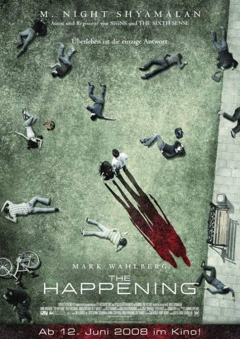
refuses to be mistaken for a love story. 3: The Happening: Say what you
want about the movie itself, but there is no denying that this poster
is gorgeous in an extremely creepy way. Again this is one of those
posters that make you want to ask questions. Why are all these people
dead? Why are two people remaining? Why can’t I see their face? Why
are the shadows long and red? Is it because they are reflected in the
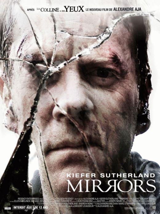
terror of the situation as larger than life beings? You get the idea. 2: Mirrors : This is an
international poster for the film Mirrors which like the Happening, had
a very mixed group of reviews. There is no denying the beauty in the
poster though. It is clearly homage to the poster for Straw Dogs but
in this case the interpretation is a little bit more direct. The crack
over our main character is many ways points to the fractured mental
state (or journey) of Jack Bauer while he has also clearly been through
a battle. When you take a step back (and remember the name of the
title), you also notice that this is a reflection. It is something
that Kiefer has to get past what he sees in him in order to succeed?
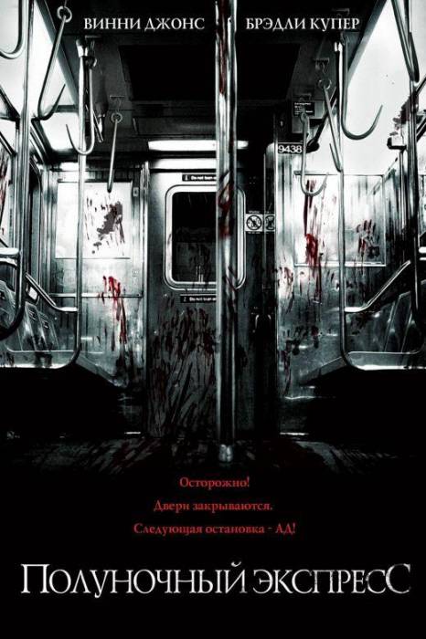
Again with the questions… 1: Midnight Meat Train: This is
another international poster (Russia?) with some writing that appears
to be absent from the English language versions of the poster. Either
way, the poster is absolutely beautiful an absolutely horrific way. It
asks a ton of questions, it has no characters in it what so ever (with
no mention of actors) and it completely focuses the viewer on the
visual epitome of the title alone. The colors astound me with the
silver finish (which reminds me of sterile meat packing plant), the red
blood, and the black floor practically are all asking for attention
from the viewer (but not demanding it). This is an amazing and
beautiful poster and when you mix all of those elements with the meat
hooks hanging from the ceiling (as a visual clue) and we can’t help but
see this poster and think “this is going to be awesome”. Posted By : PoppaScotch